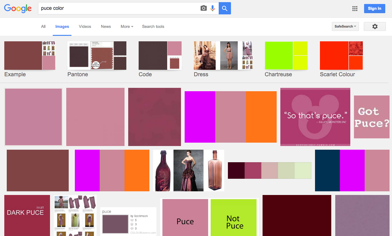
One of the big problems with using names to describe colours is that everyone seems to have a slightly different interpretation of what the colour name really looks like. Puce is a great example. I did a little survey around the design studio asking people to describe "puce." The results: 1 "magenta pink," 1 "eggplanty purple," 1 "red-orange-coppery," 2 "bluish," 1 "peachy pink," 1 "turquoise," 4 "light purple/greyish violet," 1 "silverish-grey," and 4 "yellow green." So basically every colour.
Puce actually comes from the French word puce, translating to "flea" or "flea-coloured", which in turn comes from the Latin word pucilem meaning "flea" as well. Our language-ancestors seemed to have such an intimate connection with the pests that it was a common enough word to describe a brownish-purple colour. There are many different ways to spell it, but "puce" has been the most common in English since the 1680's.
Puce is not exactly an everyday way to describe colour. Most of the designers I asked didn't even know it was a real colour. The most popular comment I got after asking them to describe puce was "it sounds like puke." This is perhaps why in recent years Puce has been more often confused with Chartreuse (read about that colour here) or sickly yellowish-greens than with brownish-purples. Today, the colour "puce" can most commonly mean yellowish-green, brownish-purple, or a mauve/purple-pink, depending on whom you ask.
Screenshot of search results for "puce color" tends to show a pinkish hue


